Tuesday, June 1, 2010

Starry Night, etc.


I was in school in one of the PC labs and I finished a project I was doing for class early. I opened Paint and decided to re-create Van Gogh's Starry Night. I think it came out pretty well! I'm so happy about it. There's stuff missing because I was doing this from memory, but oh well. For Paint, I'm pretty happy.

School's almost over! Woo Hoo!

Tuesday, May 11, 2010

Helvetica

I love typefaces. Since my dad is an editor at the Boston Globe, we sometimes get into discussions about type faces. I love the idea that the way a word looks can determine the way a reader feels about it. I'm not into graphic design, but type face is fascinating. The image above is a comparison of two very similar typefaces, Arial and Helvetica. You've seen them both a hundred times. Helvetica makes up the CVS logo, the Target logo, the Staples logo, American Apparel, Crate and Barrel (except for the capitol C), American Airlines, the New York City subway system and more. Helvetica was developed in 1957 as a way for businesses to say "Don't worry, everything is okay." It's anonymous, it's unobtrusive, and it gets the message across quickly. It's a beautiful type face that many designers regard as one of the best ever made. There has even been a documentary made about this typeface, which I have seen, and loved thank you very much. In school I am writing a 6 page research paper about the change brought to the advertising world by this modern sans-serif font. 

But Arial and Helvetica look so much alike! How can I tell them apart? That's easy! Look at the capitol 'G' in Helvetica and compare it to the same letter in Arial. Helvetica's 'G' has a tail. Also, look at the ends of the 'C' in either capitol and lower case or the top of the lower case 't' in both fonts. In Arial, these spots are slanted instead of straight. Many letters in Arial end in a slant, whereas in Helvetica they are blunt. Also, the capitol 'A' is wider in Arial than in Helvetica.
Think you have the differences down? Take this quiz and let me know your results!

For more type-face-y fun, look on YouTube for Font Conference by College Humor, one of my all time favorite videos. Wanna talk fonts and type faces with me? I love having these weird, nerdy discussions.

Sunday, May 9, 2010

May Sketches/Doodles

Hey all! I know it's been a while since I last posted. I've been experiencing a crazy school schedule lately, not to mention work and other stressors. I've been doodling a little, although nothing is finished. I just ended an 8 week pre-college course at Montserrat College of Art in Beverly that was designed to help my college portfolio so someday I may post some of those pieces.
Here are a few recent doodles I thought were fun.

Also, I recently found this video on another artist's blog and I love it so much! The band re-creates works by the masters and incorporates their instruments. It's so fun.

Wednesday, March 31, 2010

Lonely Stranger


It's been raining too much lately. I usually love rain, but it's been ruining my mood.
Drawn in pencil, then inked into my small white sketchbook. In the style of Edward Gorey, if you couldn't tell...

Monday, March 29, 2010

Carryin' Da Banner!


To all you Jews out there, Happy Passover!
I did this piece in my small white sketchbook sometime last week. I collaged newspaper right onto the page, then sketched out the newsie. I inked it right onto the paper, used white colored pencil on his shirt and socks, and erased the newsprint out of the drawing so it would stand out more. I'm really pleased with it.
Edward Gorey has been having a heavy influence in the style of my inking lately. I'm using more delicate, intricate patterning and some darker, more victorian themes which you may see more of. He's one of my favorite illustrators.
Also the musical Newsies really affected this piece. Ever since I first saw it, the songs have been stuck in my head. I love the atmosphere around the Newsies.

"Jack Kelly: Extry, extry, read all about it! Ellis Island in flames! 
David Jacobs: Hey, where's that story? 
Jack Kelly: Page nine. Thousands Flee in Panic! 
David Jacobs: "Trash Fire Next To Immigration Building Terrifies Seagulls"? 
Jack Kelly: Terrified Flight from Inferno! "

Sunday, March 28, 2010

Nghhuuugghhhhh! (That's Zombie for 'I Love You!')


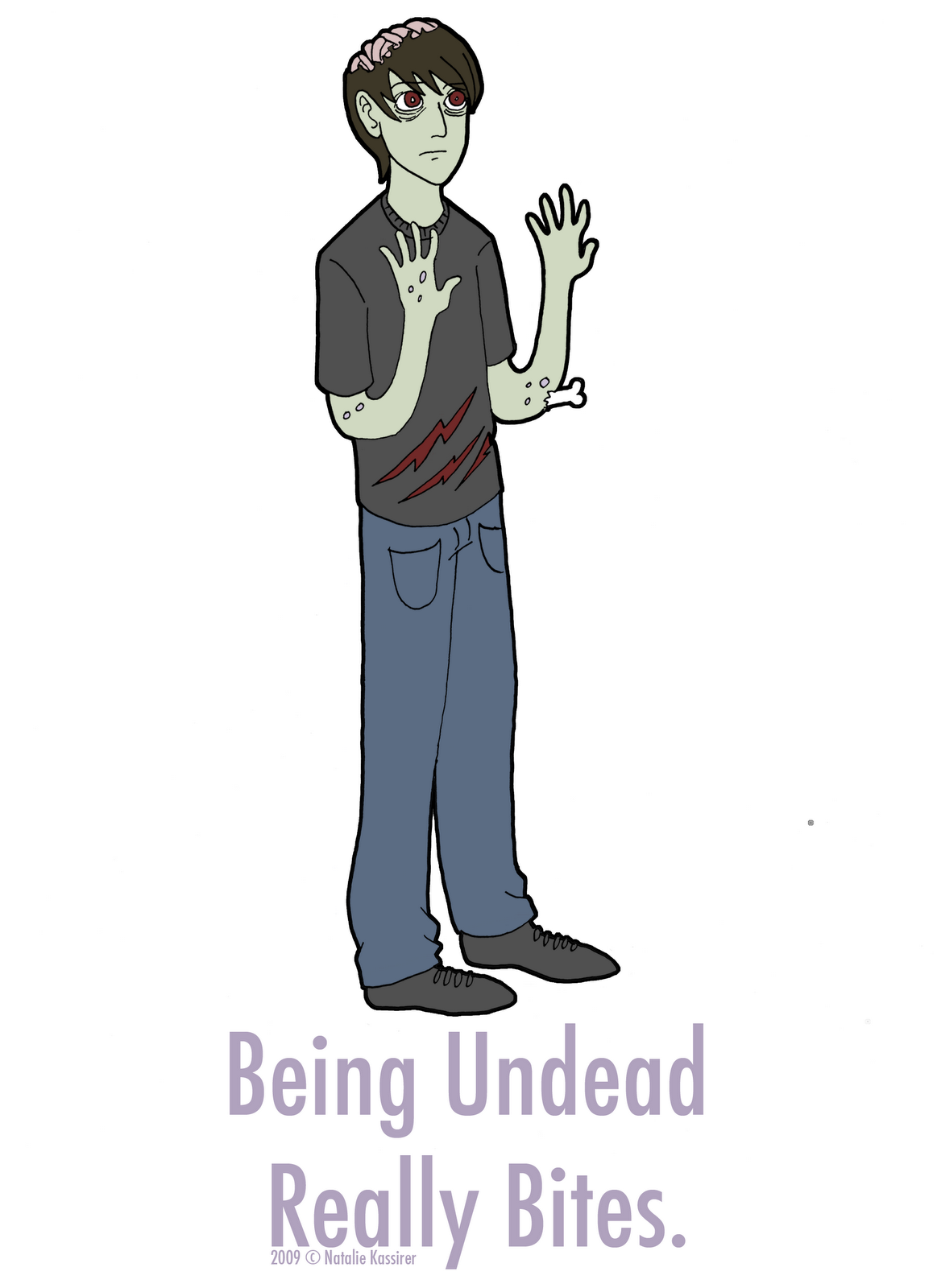
Ever felt a little hollow inside? Ever felt a little slow? Ever desired more brains? You may be a member of the living dead! For those of us who feel undead, look undead, sympathise with the undead, or hunt the undead, show your pride with my 'Being Undead Really Bites' sticker. Measuring 3 1/8" x 7 1/4", it's the perfect size to stick on a notebook, laptop, instrument case, or Winchester 1887. Buy 1 for $1 or 3  for $2. Email me, comment, or find me on Facebook to order.

Saturday, March 27, 2010

New 'Do!

This weekend we went up to Maine and stayed at my grandparents' beautiful house in Kennebunkport for an open house at the Maine College of Art. While we were there, mom cut my hair. I decided to draw myself with my new hair. This one is kind of in the style of Karl Kwasny and other more nautical drawings. I'd like to put some sepia-tone value into this drawing someday. Drawn in pencil in my sketchbook, then inked in brown brush-marker.

MECA is a really cool school. They have all these huge, sprawling departments, and the illustration department really got me juiced. I wanna be there so bad! Sadly, Portland is a little to small for my taste. I wanna be in a slightly busier city.